To what extent can product packaging be an illicit look-alike of a competitor’s product packaging? A ruling by the Court of Turin provides some guidance on look-alikes and trade dress protection. Look-alikes are deemed to contravene Italy’s unfair competition rule. Consequently, the Court granted a preliminary injunction in favor of the applicant. This case provides an insight into how Italian courts will assess infringing products of this nature.
The background
In 2012, Procter & Gamble (“P&G”) launched ‘ZzzQuil‘, a health supplement based on a blend of chamomile, lavender and valerian. The supplement claims to harness the beneficial effects of melatonin to naturally regulate the sleep/wake cycle.
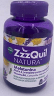
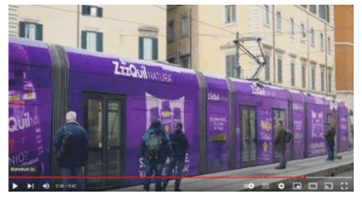
In 2019, ‘ZzzQuil NATURA’ was launched in Italy as part of the product range and comes in the form of berry-flavoured gummy tablets. It is sold in a distinctive purple bottle with a white label. An extensive advertising campaign was launched across multiple media channels which included online, television, newspapers and even large format advertising on public transport. Trains in various Italian cities were adorned with the characteristic purple colour and white font. The brand name and images of the product were clearly displayed (as shown below):


Look-alike and trade dress infringement
P&G commenced preliminary injunction proceedings against a competing sleep supplement provider. The competitor had launched a supplement under the name “Dolce Sonno” (Italian translation of “sweet dreams”). Like ‘ZzzQuil’, “Dolce Sonno”:
i) was based on melatonin and natural essences;
ii) came in a berry-flavoured gummy tablet; and
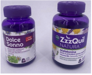
iii) was sold in nearly identical packaging to ZzzQuil NATURA – a similar a shade of purple reminiscent of a night sky, a white label and other elements (see comparison of the two products below):

P&G claimed that by manufacturing and marketing Dolce Sonno in strikingly similar trade dress, the maker of Dolce Sonno engaged in conduct that amounted to unfair competition. Therefore, the packaging of Dolce Sonno was argued to be a slavish imitation of ZzzQuil NATURA’s packaging and as a result, consumers would be confused as to the commercial origin of the product. P&G claimed that its competitor’s conduct amounted to infringement of the unregistered 3D trademark comprising the ‘ZzzQuil NATURA packaging.
The defense
The defendant relied on the following grounds to defend its conduct:
- the ZzzQuil NATURA packaging lacked originality;
- P&G could not claim exclusivity in the purple color, as the colour signified the dark night sky and berries that were an ingredient in the supplement;
- the market was crowded by other supplements characterized by a similar recipe, similar format (berry-flavoured gummy tablets) and similar purple packaging;
- the product in question was distinguished by the trademarks “Sanavita” and “Dolce Sonno” which were completely different to “ZzzQuill” so there was little risk of confusion; and
- the products were distributed through different channels.
The finding
However the above arguments did not convince the Court, which granted the preliminary injunction in favour of P&G.
In making this finding, the Judge held that the applicant’s packaging was original and distinctive. In particular, the P&G’s packaging was deemed to have acquired distinctiveness by virtue of the mass advertising campaign that was executed throughout Italy and totaled an investment of almost 21 million euros by P&G.
Any argument made by defendant that the applicant was effectively trying to secure a monopoly on the purple color was rejected by the Court. The Judge considered that P&G did not contest the mere use of the purple color, but rather, claimed that the combination of the purple colour with other characteristics of the packaging, were effectively reproduced in the defendant’s product, which led to the striking similarity between the products.
Similar features
- the shape and colour of the bottle, all being made of purple plastic, including the cap;
- the white label with a central purple band with white lettering;
- the images of the flowers and herbs, with predominantly green and purple tones and a few touches of yellow; and
- the image of the gummy tablet, with an inscription of the number of tablets in the bottle.
Although the Judge undertook a comparative analysis of each individual element, what was most striking was the remarkable similarity in the overall appearance of the two bottles. It was held that this overall similarity was likely to indicate to consumers that the products belonged to the same product line or originated from the same business.
Furthermore, the Judge noted that the risk of confusion caused by the nearly identical packaging was not sufficiently mitigated by the use of different word trademarks. Although other similar products were on the market, the presence of these similar products, while bearing some relevance, did not sufficiently displace the overall impression created between the two products in question.
Look-alikes and trade dress protection
In a nutshell, the Court held that this was a blatant case of look-alike packaging by a competitor seeking to take advantage of a successful product in the market in order to facilitate sales of its own products. While there was no imitation of a brand name, the blatant copying of a competitor’s packaging had the effect of exploiting the familiarity that consumers had with a product that is well-known and recognizable in the market.
This case offers, among other things, some criteria to follow when assessing competing products’ packaging and provides some clarification on what a court may consider to be relevant in the assessment.
While in some circumstances, competitors can adopt features for their products which are considered to be industry standard practice or commonplace (and therefore not controversial), the issue of product look alikes can arise when, despite the use of different trademarks, there is significant overall similarity between products when they are compared. It is problematic when the distinctive combination arising from graphics, shape and colour elements of packaging that a trader has adopted, which have become recognizable in the market, has been adopted by a competitor. In these circumstances, an inference can be drawn that a trader set out to create a “dupe” of the original thereby saving on the investment needed to launch a product by taking advantage of a brand that already has significant reputation in the market.
Read similar articles here:
Bird & Bird is an international law firm that was founded in London in 1846. The firm has since expanded to over 30 offices in Europe, Asia, and the Middle East, and has a particular focus on the technology, media, and telecommunications sectors.
Please visit the firm link to site


